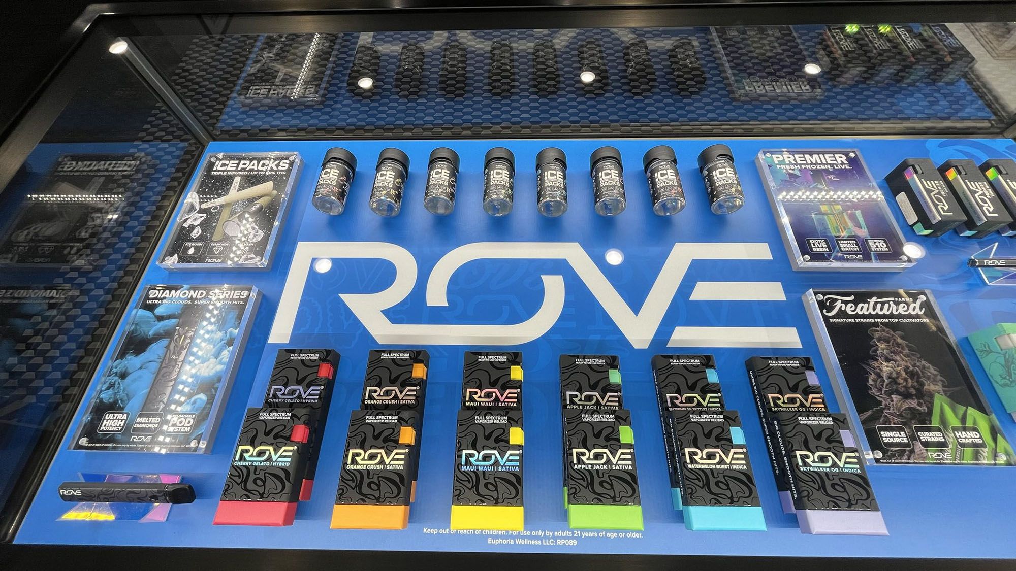
Branding and packaging have become the silent sales team of cannabis. In a crowded wall of gummies, vapes, pre-rolls, and tinctures, the pack is the shopper’s first handshake with a brand: it signals quality, effects, and values in the split second before price or budtender advice kicks in. As the category matures and behaves more like traditional CPG, distinct brand systems and packaging architectures increasingly determine who gets picked up and who gets passed over. Industry research shows cannabis shopping dynamics now mirror CPG in important ways, making brand and pack design core revenue drivers.
Why it moves product: packaging shortcuts decisions. Clear dosage, strain type, and effect cues (sleep, focus, relax) reduce friction for new and occasional consumers while letting experienced shoppers trade up within a brand family. Consumer studies consistently find cannabis shoppers navigate choices like other packaged goods, where on-pack information and shelf signals heavily influence trial and repeat. Add in tactile finishes, resealable formats, and portable form factors, and the package becomes part of the user experience—not just a container.
Design also changes perceived value. Recent research found consumers would pay significantly more for flower with memorable, giftable packaging, and a majority view premium-branded cannabis as “gift-worthy.” That willingness to pay supports margin—especially important as price compression pressures operators. Pricing analyses similarly note that brand and pack signals help explain why some items resist discounting even in competitive markets.
Values matter, too. Reports highlight a meaningful cohort seeking eco-friendly options; sustainability claims such as recyclable, post-consumer materials or reduced plastic can tip purchase decisions when price and potency are similar. Messaging space on the pack is precious real estate to tell that sustainability or social-impact story in seconds.
Compliance is not the opposite of creativity. The best brands treat child-resistant, tamper-evident, and labeling rules as constraints that drive distinctive solutions. Thoughtful icon systems, plain-English warnings, and legible potency panels build trust. That trust pays off: industry trackers report that roughly half of adults in legal markets consume, and clear, credible packs lower the barrier for the next wave of first-time buyers.
What wins at shelf right now? Cohesive families (consistent color, typography, and architecture across SKUs), easy effect navigation, premium yet responsible materials, and limited releases with collectible storytelling—trends packaging experts flag as increasingly decisive. Retailers reward brands that make resets easier—clean facings, scannable barcodes, and cases that protect inventory. Analytics show brands that stay in stock and stay legible gain share, because shoppers default to what they can quickly understand and find.
Bottom line: branding and packaging are not “nice-to-have.” They are revenue levers. Clarity converts, design premiumizes, and values differentiate. In a market where products can feel interchangeable, the box, jar, or pouch is often the deciding factor—and the most scalable ad space a cannabis brand owns.
For emerging brands, three quick wins: build a simple effect icon system, upgrade closures to preserve freshness, and test two front-panel layouts with shoppers before scaling. Small changes at the pack face outperform big media buys at launch.